9 Modelling
The actuarial syllabus extensively covers the principles behind modelling and the various models that can be used. The 2019 curriculum also includes code to implement them in R. This section therefore briefly covers the more frequently used models, as well as some that are outside of the actuarial syllabus. The aim is to illustrate how these models can be parameterised in a programming context.
9.1 Plots
When deciding which distribution is a suitable fit for a data set, the use of box plots can help. They can illustrate the distribution, interquartile ranges, and skewness of the data, in addition to helping indentify the presence of outliers.
# simulate 200 data points from a standard normal distribution
dummy_data <- rnorm(200, 0, 1)
boxplot(dummy_data, horizontal = TRUE)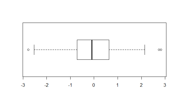
Figure 9.1: Sample boxplot
When assessing the goodness of fit, in addition to standard statistical tests, a visual comparison of the distribution against an assumed curve is also helpful.
# plot the data in a histogram to view its distribution
hist(dummy_data,
     probability = TRUE,
     ylim=c(0,0.4))

# add a curve with the assumed distribution for a visual comparison
curve(dnorm(x,
            mean = mean(dummy_data),
            sd = sd(dummy_data)),
      col= "red",
      lwd = 3,
      add = TRUE)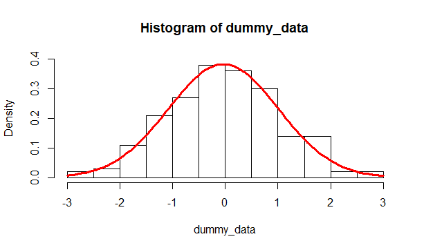
Figure 9.2: Histogram of the data against an assumed fitted distribution
9.2 Linear regression
Simulating the standard linear model \(y_{i}=\beta_{0}+\beta_{1}x_{i}+\epsilon\) where \(\epsilon \sim N\left(0,\sigma^2\right)\) will then allow for a demonstration of how to then fit a linear model to a given data set.
# define and set parameters
n <- 50; b0 <- 12; b1 <- 3; sig <- 10

# simulate linear model
x <- sort(runif(n, min = 0, max = 100))
e <- rnorm(n, 0, sig)
y <- b0 + b1*x + e

# plot data
library(tidyverse)
data_for_plot <- tibble(x=x, y=y)
data_for_plot %>% ggplot(aes(x=x,y=y)) + geom_point()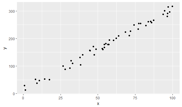
Figure 9.3: A simulation of a linear model
The linear model can then be fitted to these variables by using the lm function and specifying the model form. An intercept term is inculded by default, hence the linear model above need only be represented as y ~ x. A linear model without an intercept can be constructed using the y ~ -1 + x formula input instead. Higher order polynomials can also be modelled, eg the quadratic model can be run using the y ~ x + I(x^2) form.
# fit linear model to the data
linear_fit <- lm(y~x, data = data_for_plot)

# add model predictions to the data object for plotting
data_for_plot$fit <- linear_fit$fitted.values
data_for_plot %>% ggplot() +
  geom_point(aes(x=x,y=y)) +
  geom_line(aes(x=x, y=fit), color = "red", size = 1)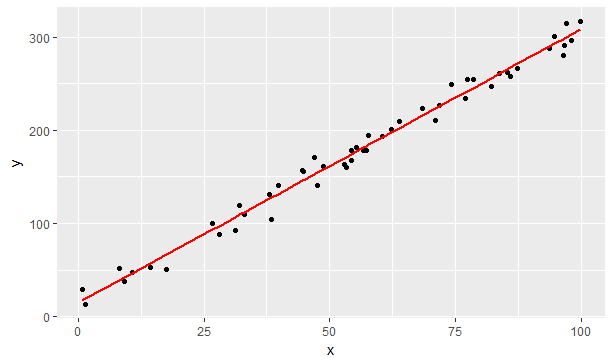
Figure 9.4: Simulated data with fitted linear model
The object returned from the lm function has a raft of useful properties. In the example above, the fitted.values property returned the result of the model on the known x values. Calling the fitted model with the summary function returns statistical properties such as the \(R^2\) goodness of fit metric.
summary(linear_fit)

# Call:
# lm(formula = y ~ x, data = data_for_plot)
#
# Residuals:
#      Min       1Q   Median       3Q      Max
# -23.2935  -7.1105   0.4156   8.5801  18.2447
#
# Coefficients:
#             Estimate Std. Error t value Pr(>|t|)
# (Intercept) 15.05453    3.14716   4.784 1.68e-05 ***
# x            2.93288    0.05019  58.433  < 2e-16 ***
# ---
# Signif. codes:  0 ‘***’ 0.001 ‘**’ 0.01 ‘*’ 0.05 ‘.’ 0.1 ‘ ’ 1
#
# Residual standard error: 9.879 on 48 degrees of freedom
# Multiple R-squared:  0.9861,  Adjusted R-squared:  0.9858
# F-statistic:  3414 on 1 and 48 DF,  p-value: < 2.2e-16
We can see that the linear_fit derives coefficients (and ranges) that are close to our initial parameters (15.1 and 3.1 versus 12 and 3) and that the model is a good fit (\(R^2 = 0.986\)).
9.3 Generalised Linear models
The linear model is not suitable for all modelling situations. For example, the linear model \(p_{i}=\beta_{0}+\beta_{i}x_{i}\) would not be suitable for modelling probabilities - the model can return values which are either less than 0 or greater than 1. To generalise the application of linear modelling, a link function can be used to transform a variable into a form that can be modelled by a linear predictor. Here, the logit function can be used instead in the form \(\ln\left(\frac{p_{i}}{1-p_{i}}\right)=\beta_{0}+\beta_{i}x_{i}\). This model for \(p_{i}\) would now work, as it is equivalent to the model \(p_{i}=\frac{e^{\beta_{0}+\beta_{i}x_{i}}}{1+e^{\beta_{0}+\beta_{i}x_{i}}}\), which is bounded between 0 and 1. Other distributions from the exponential family can also be modelled as a generalised linear model.
One of the data sets present in R is the Titanic survival data, broken down by the three factors of Class, Age and Sex. Logistic regression can be performed on this data using the glm function for the binomial case of the exponential family. The -1 term removes the inclusion of the intercept term \(\beta_{0}\).
# Load Titanic survival data
T_aggregate <- as.data.frame(Titanic)
# Convert summary data into observations
Titanic_granular <- T_aggregate[rep(1:nrow(T_aggregate), T_aggregate[,5]), -5]

# fit glm, where the probability of survival is modelled on the person's
# Class, Age and Sex (excluding the intercept)
Titanic_glm <- glm(Survived ~ Class + Age + Sex - 1,
                   data = Titanic_granular,
                   family = binomial)
summary(Titanic_glm)

# Call:
# glm(formula = Survived ~ Class + Age + Sex - 1, family = binomial,
#     data = Titanic_granular)
#
# Deviance Residuals:
#     Min       1Q   Median       3Q      Max
# -2.0812  -0.7149  -0.6656   0.6858   2.1278
#
# Coefficients:
#           Estimate Std. Error z value Pr(>|z|)
# Class1st    0.6853     0.2730   2.510   0.0121 *
# Class2nd   -0.3328     0.2686  -1.239   0.2155
# Class3rd   -1.0924     0.2370  -4.609 4.05e-06 ***
# ClassCrew  -0.1724     0.2567  -0.671   0.5020
# AgeAdult   -1.0615     0.2440  -4.350 1.36e-05 ***
# SexFemale   2.4201     0.1404  17.236  < 2e-16 ***
# ---
# Signif. codes:  0 ‘***’ 0.001 ‘**’ 0.01 ‘*’ 0.05 ‘.’ 0.1 ‘ ’ 1
#
# (Dispersion parameter for binomial family taken to be 1)
#
#     Null deviance: 3051.2  on 2201  degrees of freedom
# Residual deviance: 2210.1  on 2195  degrees of freedom
# AIC: 2222.1
#
# Number of Fisher Scoring iterations: 4
The parameter for each possibility in each factor repesents whether this increases or decreases the likelihood of survival.
| Class1st | Class2nd | Class3rd | ClassCrew | AgeAdult | SexFemale |
|---|---|---|---|---|---|
| 0.6853195 | -0.3327755 | -1.092443 | -0.1723567 | -1.061542 | 2.42006 |
All possibilities have a unique estimate in the summary output above, exlcuding the SexMale and AgeChild possibilities as these are considered to be the baseline against which the other factors are expressed. Given SexFemale is positive, this implies women had a far greater chance of survival on the Titanic than men. Those in Class1st also had a better chance than those in any other Class, and whilst ClassCrew appears to negatively affect survival chances, this isn’t statistically significant as the standard error range traverses 0 (i.e -0.1724 + 0.2567 > 0). The Akaike information criterion (AIC) value can be used to compare the strengths of different model forms (e.g. Survived ~ Age + Sex only) - the lower the AIC the better.
9.4 K-means clustering
Machine learning is a subject that also considers models that can be fitted to an observed data set. The terminology is somewhat different in that these models use supervised or unsupervised algorithms to train a model on a training set. Nonetheless, the process is analagous to the regression discussed so far - in fact, regression is considered a tool within the machine learning literature.
An example of machine learning that is not in the actuarial syllabus is K-means clustering. As described by Hartigan and Wong in their 1979 paper on the topic, “The aim of the K-means algorithm aims to divide M points in N dimensions into K clusters, so that the within-cluster sum of squares is minimised”. Minimising the sum of squares statistic is also the basis of linear regression.
This algorithm can be applied to the classic iris data set, which contains sepal length & width and petal length & width, for 50 flowers from each of 3 species of iris. Plotting the petal variables indicates a clear clustering of the three species.
iris %>% group_by(Species) %>%
  ggplot(aes(Petal.Length, Petal.Width, group=Species, color=Species)) +
  geom_point()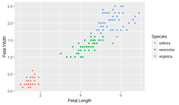
Figure 9.5: Petal length and width for three species of iris
The K-means algorithm requires as an input assumption the number of clusters (K) to model. Given there are three species, the algorithm can now be run to find a set of three coordinates in the two (N) dimensions illustrates above in 9.5 which best minimises the within-cluster sum of squares statistic over the 150 (M) observations.
# Run k-means on petal variables only
iris_p_km <- kmeans(iris[,3:4], 3)
iris$cluster <- iris_p_km$cluster

iris %>% group_by(Species) %>%
  ggplot(aes(Petal.Length, Petal.Width, group=Species, color=Species)) +
  geom_point(aes(shape=as.factor(cluster)))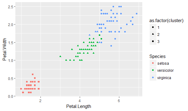
Figure 9.6: K-means algorithm applied to the iris data set
We can see that the assigned clusters (shapes) very much align to the species (colours). There are some exceptions where the virginica and versicolor species overlap, as illustrated by the presence of green circles and blue triangles. The fitted model can reveal the goodness of fit.
# Percentage of the variance explained by the model
iris_p_km$betweenss / iris_p_km$totss
# [1] 0.9429785

# Model v Actual species
table(iris$Species, iris$cluster)

#               1  2  3
#   setosa      0  0 50
#   versicolor  2 48  0
#   virginica  44  6  0
The model is a good fit (94%), and whilst setosa maps perfectly to the third cluster, the majority of the other two species map to their respective cluster as well.