8 Data Vizualisation
Programming can be used to display data in a visual format. Patterns, trends, relationships and outliers are more easily discernable when displayed as visual objects than they would otherwise be when viewed in a table. This section discusses some of the main ways of displaying data in a programming context.
8.1 Extract, Transform and Load
Before the data can be displayed, it must be loaded into the programming enviroment. The stages of this process can be split into three parts, commonly referred to by the acronym ETL; Extract, Transform and Load.
The benefit of having these steps seperately coded is that it is easy to view each part, and to change one step and rerun the entire program. With traditional software such as Excel, the ETL procedure can be intertwined with the data and visualisation, making it harder to check the processes used and to rerun or reuse the final product elsewhere.
8.1.1 Extract
Data will need to be retrieved from its source. The source can vary from local structured data files such as CSVs, Excel spreadsheets, databases etc. Data could also be retrieved from unstructured data sources, such as from web scraping, twitter feeds, emails etc.
Once extracted, the code will need to need to import the data into the programming context, eg by using a function such as read.csv(), and store it in one or more variables which can then be manipulated.
8.1.2 Transform
Once the data is stored as a variable, code can be written to transform the data into the required format. The nature of these transforms depends on the type and quality of the data, and the purposes to which it will be used. Some common transformations include:
- Removing missing data and #N/As, or replacing them with an assumed value.
- Removing extraneous fields that are not required for the current purposes.
- Adding new columns that are calculated from the loaded data.
- Filtering the data to the appropriate level of granularity.
- Aggregating the data into higher levels.
Another common programming transformation that is not really required in an Excel format is transforming wide data into long data. Consider this data from the ONS that displays the age standardised mortality rates (ASMRs) from the five biggest causes of death.
asmrs <- read.csv("https://raw.githubusercontent.com/institute-and-faculty-of-actuaries/institute-and-faculty-of-actuaries.github.io/master/markdown/snippets/ONS_ASMRs.csv?token=AKNI7CTOAC6K5AAZ2SP3UI25WL6IU")
head(asmrs) #show first 6 rows of the data and all columns
#   Years Cancer Circulatory Respiratory Mental Nervous
# 1  2001  318.3       496.9       160.6   34.0    32.7
# 2  2002  317.7       486.8       165.3   34.2    33.4
# 3  2003  312.9       473.9       175.7   35.3    35.4
# 4  2004  307.4       435.6       160.7   33.4    32.5
# 5  2005  304.0       413.1       165.0   33.4    33.4
# 6  2006  301.9       387.0       153.8   33.4    32.8
The data shows the number of deaths arising from each disease group per 100,000 population. Each Year has one row and each disease has one column. However, for most graphing libraries, the data will need to be transformed into a long format.
asmrs_long <- reshape(asmrs, varying = -1, direction = "long", v.names = 'Deaths',times = names(asmrs[-1]), timevar = 'Disease')

# transform the 2nd to 6th columns into the long format
head(asmrs_long, 20) # show first 20 rows
#               Years     Disease Deaths id
# 1.Cancer       2001      Cancer  318.3  1
# 2.Cancer       2002      Cancer  317.7  2
# 3.Cancer       2003      Cancer  312.9  3
# 4.Cancer       2004      Cancer  307.4  4
# 5.Cancer       2005      Cancer  304.0  5
# 6.Cancer       2006      Cancer  301.9  6
# 7.Cancer       2007      Cancer  300.6  7
# 8.Cancer       2008      Cancer  298.8  8
# 9.Cancer       2009      Cancer  292.9  9
# 10.Cancer      2010      Cancer  290.3 10
# 11.Cancer      2011      Cancer  289.5 11
# 12.Cancer      2012      Cancer  288.3 12
# 13.Cancer      2013      Cancer  283.5 13
# 14.Cancer      2014      Cancer  280.8 14
# 15.Cancer      2015      Cancer  278.1 15
# 16.Cancer      2016      Cancer  276.7 16
# 17.Cancer      2017      Cancer  271.9 17
# 1.Circulatory  2001 Circulatory  496.9  1
# 2.Circulatory  2002 Circulatory  486.8  2
# 3.Circulatory  2003 Circulatory  473.9  3
In the long formatted data set, we can see that the Years column is now repeated for each disease, and each disease is now a factor of the Disease column rather than its own variable in the original data set. The advantage of storing the data in this format is that were we to add a new data point, eg in 2018 the ASMR for poisoning was 50, in the long format only one row needs to be added. In the wide format, a new column and row need to be added, and all other entries in them would be unknown/#N/A.
8.1.3 Load
Once the data has been prepared to the required specification, it can be loaded into the code that will perform the desired analysis. For large scale solutions, this load process may require the processed data to be loaded into another data repository, especially if a proprietary solution is being used. For the purposes of this section, the data will just be used into some R data visualisation R packages.
8.2 One dimensional plots
The simplest type of graphs are the ones where only a variable is plotted at the time, those are typical distribution plots for numerical variables such as histograms or density plot, and proportional plots for categorical, such as pie charts and their derivates.
8.2.1 Distribution graph
The most common form of distribution graph is the histogram, which is suitable for approximating the empirical distribution of a numerical variable. In this example we would use the R built-in quakes dataset, which includes a series of 1000 earthquakes. We can then use a histogram to show the relative frequency of subgroup of a numerical variable of interest, such as the magnitude of the earthquakes.
hist(quakes$mag)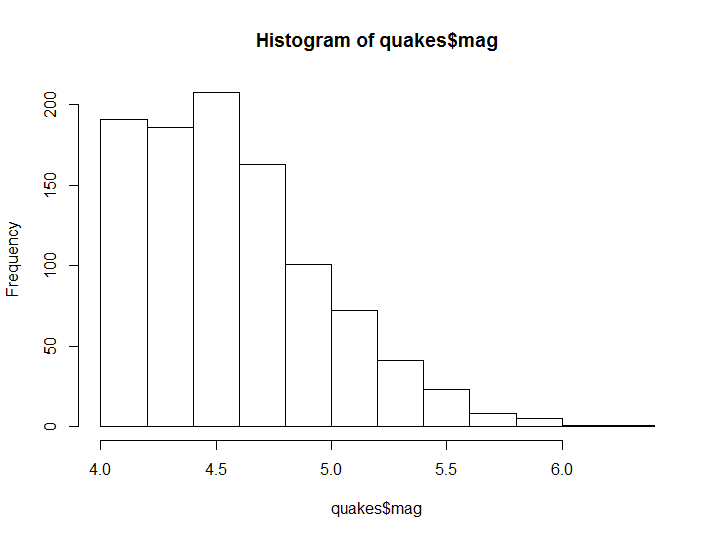
Figure 8.1: Histogram example
As you have seen the function has decided without any additional user input how many bins and where their boundaries are to be set. However the number of bins, as well as the title and axis could be modified by the user, as in the following example.
hist(quakes$mag, breaks = 20, main='Histogram of Magnitude')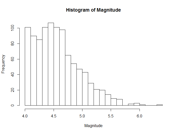
Figure 8.2: Histogram example with custom breaks and labels
In cases such as the previous one, where a histogram with a high number of breaks gives a smooth distribution we can use a density plot, which approximates the underlying empirical density distribution.
library(lattice)
densityplot(quakes$mag)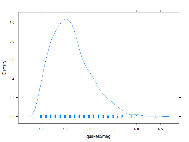
Figure 8.3: Empirical Density plot
Note that the plot also includes a scrambled mono-dimensional scatter point, from which we can infer that magnitude is registered only up to a decimal point in resolution.
For discrete categorical variables, data can be plotted using bar charts.
library(magrittr)
asmrs_long %>% subset(Years == 2017) %>% barchart(Deaths ~ Disease, .)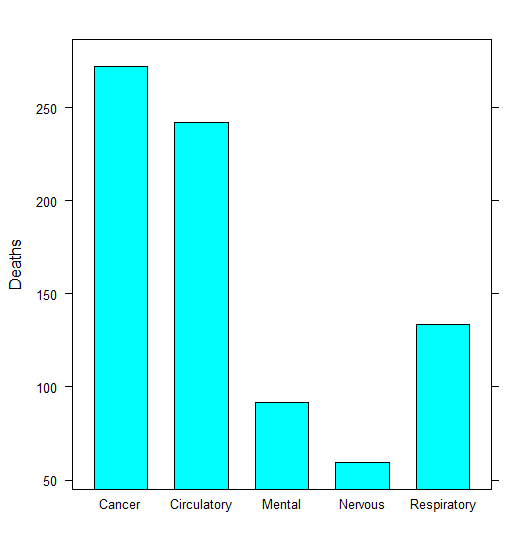
Figure 8.4: Column chart example
The subset() function has been added to filter the data.
8.2.2 Proportional graph
The most common type of graph for illustrating relative proportions are Pie charts.
asmrs_long %>% subset(Years == 2017) %$% pie(Deaths, Disease, main = '2017 Deaths by cause')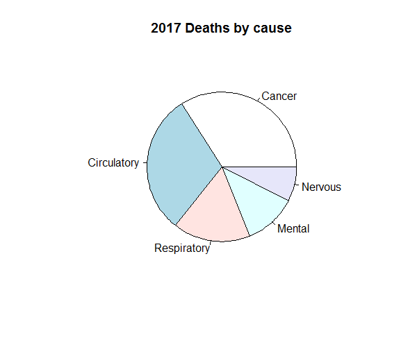
Figure 8.5: Pie chart example
However, pie charts can obscure clear trends in the data. The example beneath, as discussed in the SIAS paper “A Practical Guide to Data Visualisation”, demonstrates how. Whilst the three pie charts illustrate what appear to be similar proportions of five colours, the equivalent column charts beneath them would suggest otherwise.
](pics/8_badpie.png)
Figure 8.6: Pie charts - more than meets the eye. Original source: commons.wikimedia.org/wiki/File:Piecharts.svg
This is why there is a tendency to prefer treemap graphs, where areas assume a shape which is less deceptive to the reader.
library(treemap)
asmrs_long %>% subset(Years == 2017) %>% treemap('Disease', 'Deaths', title = '2017 Deaths by Disease')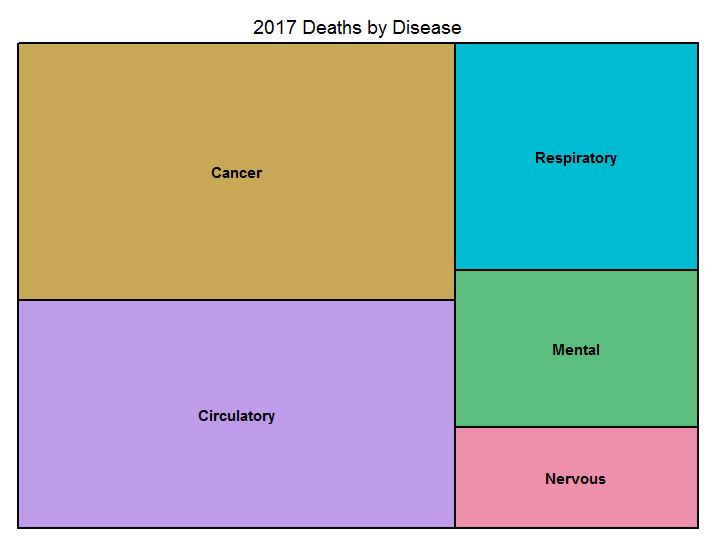
Figure 8.7: Treemap example
8.3 Bidimensional plots
Often we need to illustrate more than one dimension at a time, whether because we are representing the relationship between two variables, or a single variable and time. In order to do so different type of plots are used according to variable types.
8.3.1 X-Y plots
For numerical variables, simply plotting two dimensions of the data against each other can illustrate any relationships that exists between them, as well as detect any outliers that are present. This is done typically through a scatterplot, such as this one.
plot(depth ~ mag, quakes, main = 'Magnitude-Depth Scatterplot', xlab = 'Magnitude')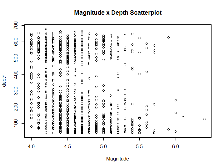
Figure 8.8: X-Y Scatter plot example
Additional information can be included in the plot by varying the colour, shape, and size of the data points. Scatterplot is indicated when both variables are continuous, however in our case we have already seen that Magnitude is discretised. Thus a stripchart would be more suitable.
stripchart(depth ~ mag, quakes, main = 'Magnitude-Depth Stripchart', ylab = 'Magnitude')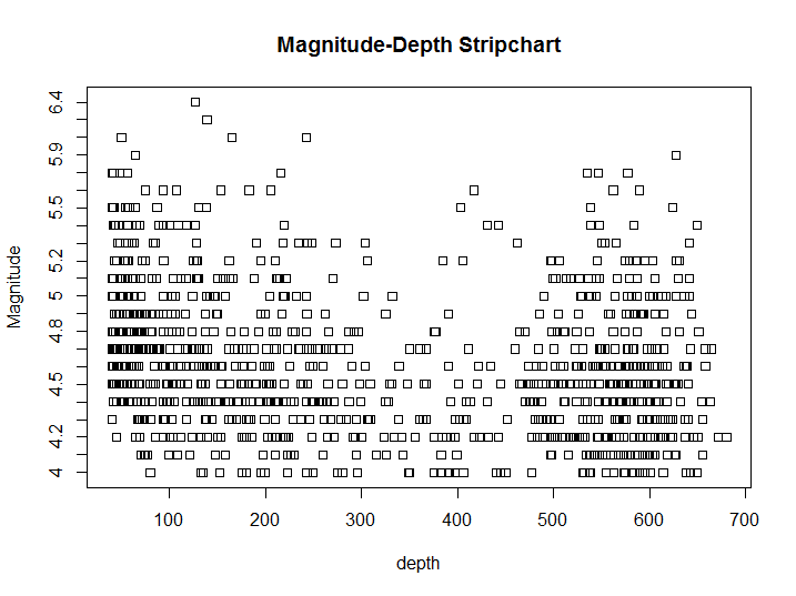
Figure 8.9: X-Y Strip chart example
The only visible difference, aside from the axis swap, is that now ticks on the Magnitude axis reflect the discrete distribution of that variable. Once we have a categorical variable and a continuous one we could show an approximate distribution of the continuous variable for each value of the distribution with a box-plot. Before building our boxplot we would make sure the variable in question is split in a limited number of groups, in order to do so we build our own grouped version of the mag variable, using the transform() function to add a variable to the original dataset and the cut() function to split the variable in 5 equal groups.
transform(quakes, group_mag = cut(mag, 5)) %>% boxplot(depth ~ group_mag, .)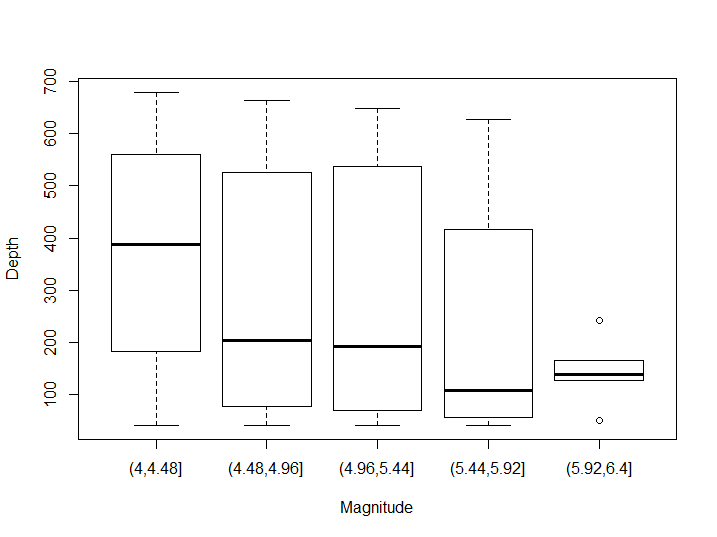
Figure 8.10: Box-plot example
As you may notice this boxplot suffers from two significant issues: groups are not homogenous in size (particularly in the last group there 2 outliers out of 5 observations), and the groups do not reflect the bimodal distribution we had already seen in the first scatterplot. In order to solve the first issue it is common either to split groups by percentiles or to pair the boxplot with an histogram. To reflect better their distribution we would use a violin plot. The ggplot2 package has a cut_number() function to split a variable into equidistributed groups, as well as a violin graph plot option.
library(ggplot2)
transform(quakes, group_mag = cut_number(mag, 5)) %>% qplot(group_mag, depth, data = ., geom = 'violin', xlab = 'Magnitude')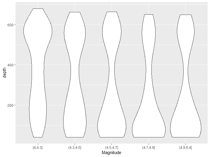
Figure 8.11: Violin plot example
From this graph we can better see the bimodal distribution of the depth of magnitude of earthquakes and we can also appreciate that the peak of the distribution moves from one peak to the other as magnitude increases.
8.3.2 Time evolution charts
When there is less of a focus on the granular data points and more interest on its trend, then line charts can be used. The simplist case uses straight lines to connect consecutive data points. More sophisticated lines and curves can be derived to fit the data, and this is the topic of the modelling section of this guide.
library(ggplot2)
qplot(Years, Deaths, col = Disease, data = asmrs_long, geom = 'line')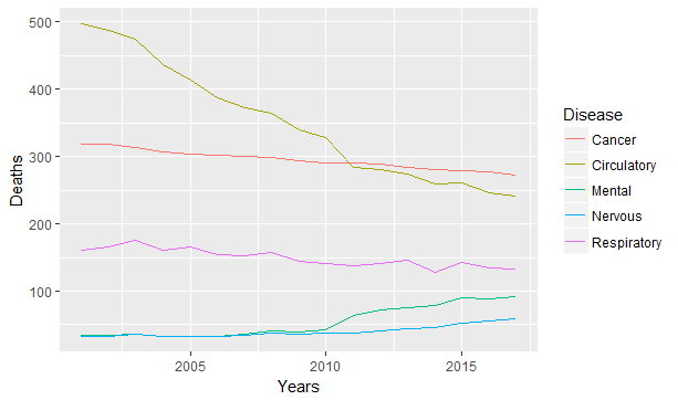
Figure 8.12: Line chart example
The ggplot2 package makes adding dimensions an easy task, and it automatically builds a legend for our graph. The same graph can be expressed also with stacked bars or area if one is interested in looking at the evolution of proportion.
qplot(Years, Deaths, fill = Disease, data = asmrs_long, geom = 'col')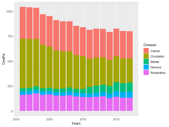
Figure 8.13: Stacked bar example
qplot(Years, Deaths, fill = Disease, data = asmrs_long, geom = 'area')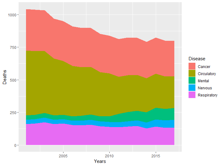
Figure 8.14: Area chart example
From the previous graphs it is easy to infer the evolution of the groups which lie closer to the base of the y axis, but it becomes progressively more difficult to determine their evolution as we stack more groups. In our case it is hard to determine if cancer rate has increased or decreased in the period. This is why this type of graphs are often shown together with line graphs, to give both an idea of mix and of the single components.
8.4 Network diagrams
Relationships can be illustrated using network diagrams, where discrete nodes are connected by edges. Using the Healthy-Sick-Dead multiple state markov model as an example:
library(visNetwork)
# define the nodes
nodes <- data.frame(
  id=1:3,
  label=c("Healthy", "Sick", "Dead"),
  color=c("Green", "Yellow", "Red")
)

# define the connecting edges
edges <- data.frame(
  from=c(1,1,2,2),
  to=c(3,2,3,1),
  length= rep(200,4),
  color=rep("black",4),
  arrows="to"
)
visNetwork(nodes, edges)
Note the use of the edge list data structure (the edges data frame) as the chosen representation of this network diagram visualisation.
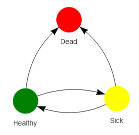
Figure 8.15: Network example illustrating the Healthy-Sick-Dead markov model
Whilst the output above is a static image, the real output from the visNetwork library is an htmlwidget, which allows for user interaction (moving nodes, selecting edges etc).